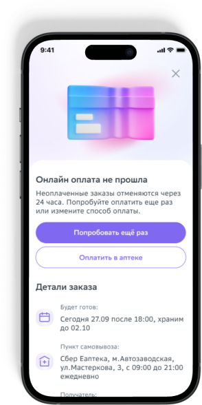
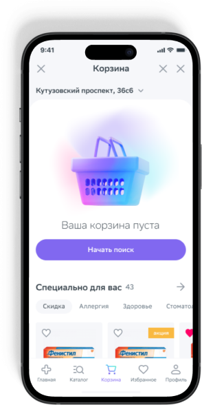
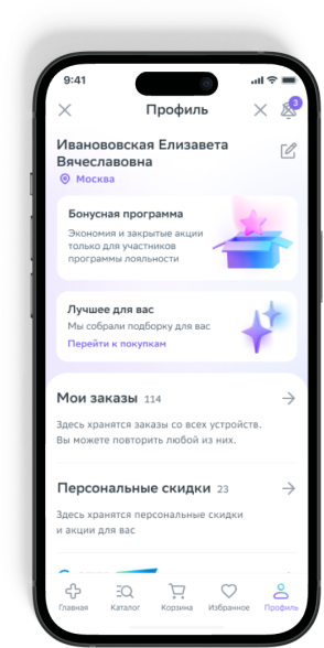
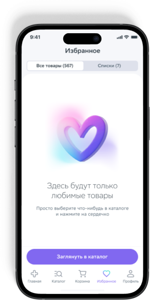
Sber Eapteka App

2021 - 2023

sber eapteka is an online pharmacy, offering a wide range of health-related products, all accessible with the convenience of home delivery

Problem

eapteka aimed to beat their closest competitor - apteka.ru to attract the potential investor, so they empowered me as a new art director

Analysis:

using app data & social rewives my team & I found out the following issues:
eapteka 2018

Design

low brand awareness rate

UI didn’t meet accessibility standards & modern trends

Metrics

lower conversion rates in the app compared to the website

minimal level of user satisfection rate
Solutions

audience research & visual identety

to enhance brand awareness & smartly select a new style, we initiated comprehensive target audience research

we outlined user persona & significantly cut research costs with the call center's assistance

average persona:

segment
age 25-50
women 60%
location
Moscow, St.Petersburg 
& central regions 
of Russiia
lifestyle
busy schedule: stably employed + care for their family
health
it's crucial to be always prepared 
& prevent illness
pharmacy
neutral attitude: want to buy all 
the necessary medications in one place at a good price.

conclusions

customers view the pharmacy as a trusted ally & assistant, expect from it high expertise, efficiency, & fair pricing 
in health matters

visual identity:

we have chosen the following symbols & associations to build trust & demonstrate expertise 
in healthcare

moodboard:


medical accessories
medical uniform elements
scientificness
cold blue shades
minimal details

pallete:

white graphite
HEX: #F6F7FA
RGBA: #F6F7FAFF
ARGB: #FFF6F7FA
graphite
HEX: #333F48
RGBA: #333F48FF
ARGB: #FF333F48
blue
HEX: #4AD6FC
RGBA: #4AD6FCFF
ARGB: #FF4AD6FC
violet
HEX: #8168F0
RGBA: #8168F0FF
ARGB: #FF8168F0
pink
HEX: #FF1F78
RGBA: #FF1F78FF
ARGB: #FFFF1F78

we teamed up with marketing to introduce a signature cool pink, setting our pharmacy brand apart from the others

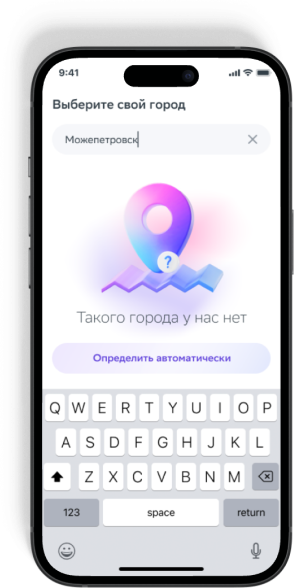
3D illustrations highlight Eapteka cutting-edge technology & commitment to superior expertise

soft & charming style emphasize the service's friendliness

more eapteka branding behance

eapteka 2018
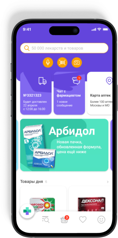
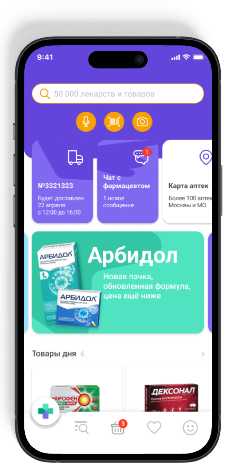
eapteka 2021

UX changes

address selection
at login

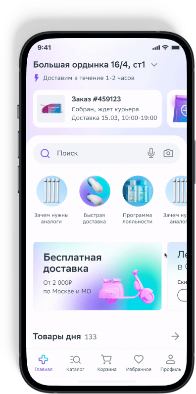
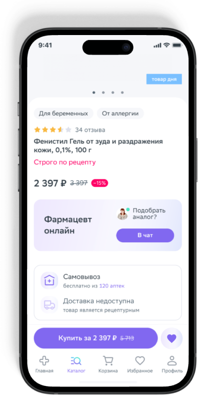
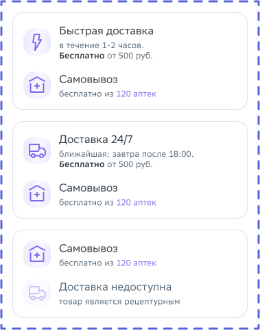
we sugested users to enter their address when they log in to the app, so we were able to estimate delivery time for different products directly on the product page,

this approach reduced cart abandonmen & increased convertion rate

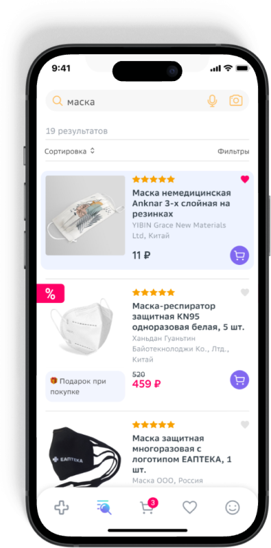
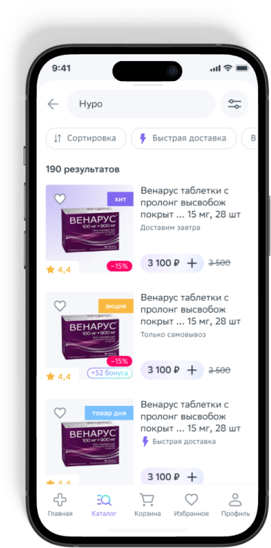
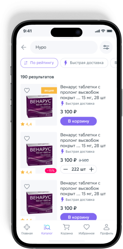
search result interfaces

usability tests revealed that the search results' product cards were overly high
the 'add to cart' button too small, & excessive labels & ads distracted users
2018
2021 (1)
-20%

(1)
the initial version
of the search result interface unexpectedly caused a 20% drop in conversion rates

2021 (2)
+36,9%

(2)
after a new round
of user testing, we crafted
an alternative design that
not only restored our
previous conversion rates
but also boosted them
by an additional 16.9%

results

№1 free app in russian app store, medical category
1.7M new clients
X2 brand awareness has increased
(from 28% to 52%)
X2 order growth rate
5.5M mobile app installs
get a free consult:

see me fit to your project? get in touch

please, fill the form & I will contact you within 24 hours or drop me email: hello@anya-cooper.com